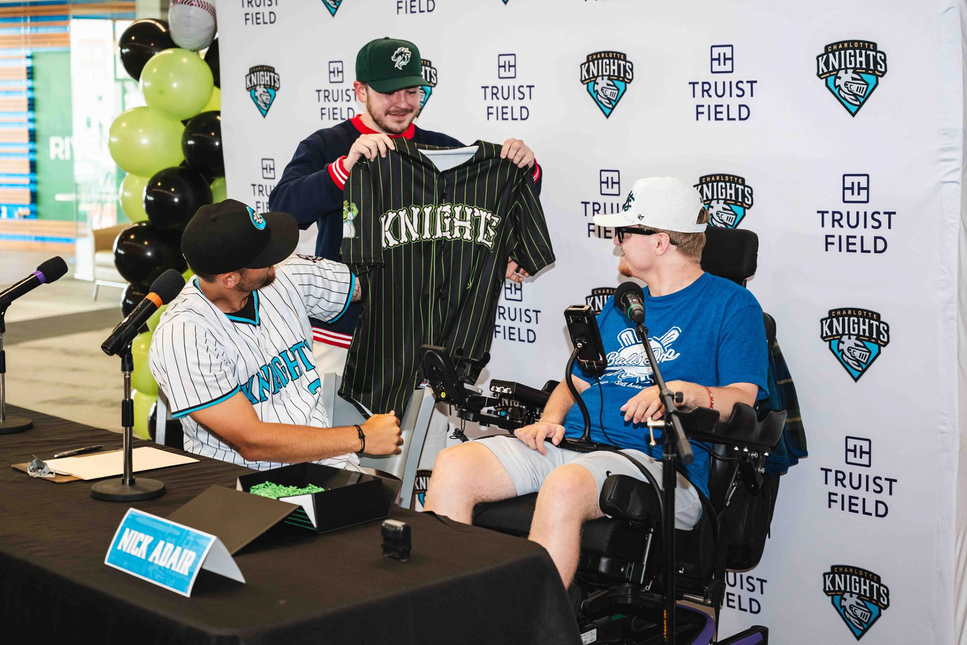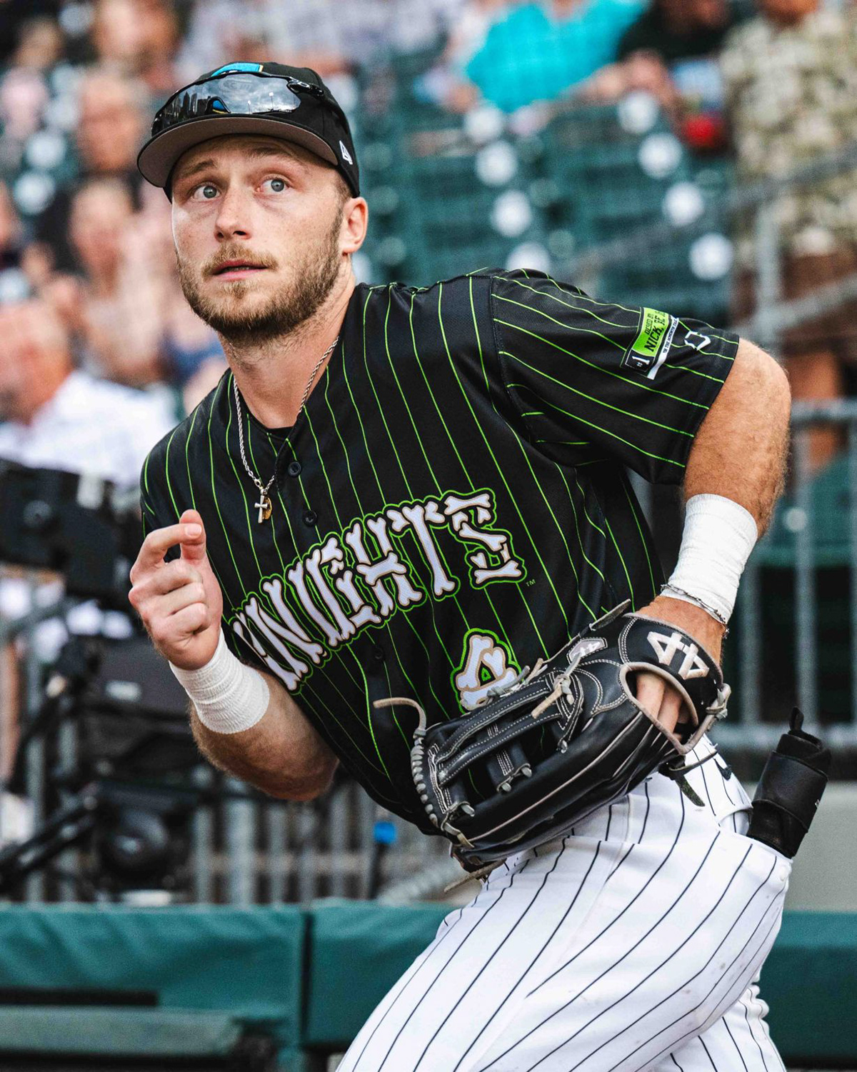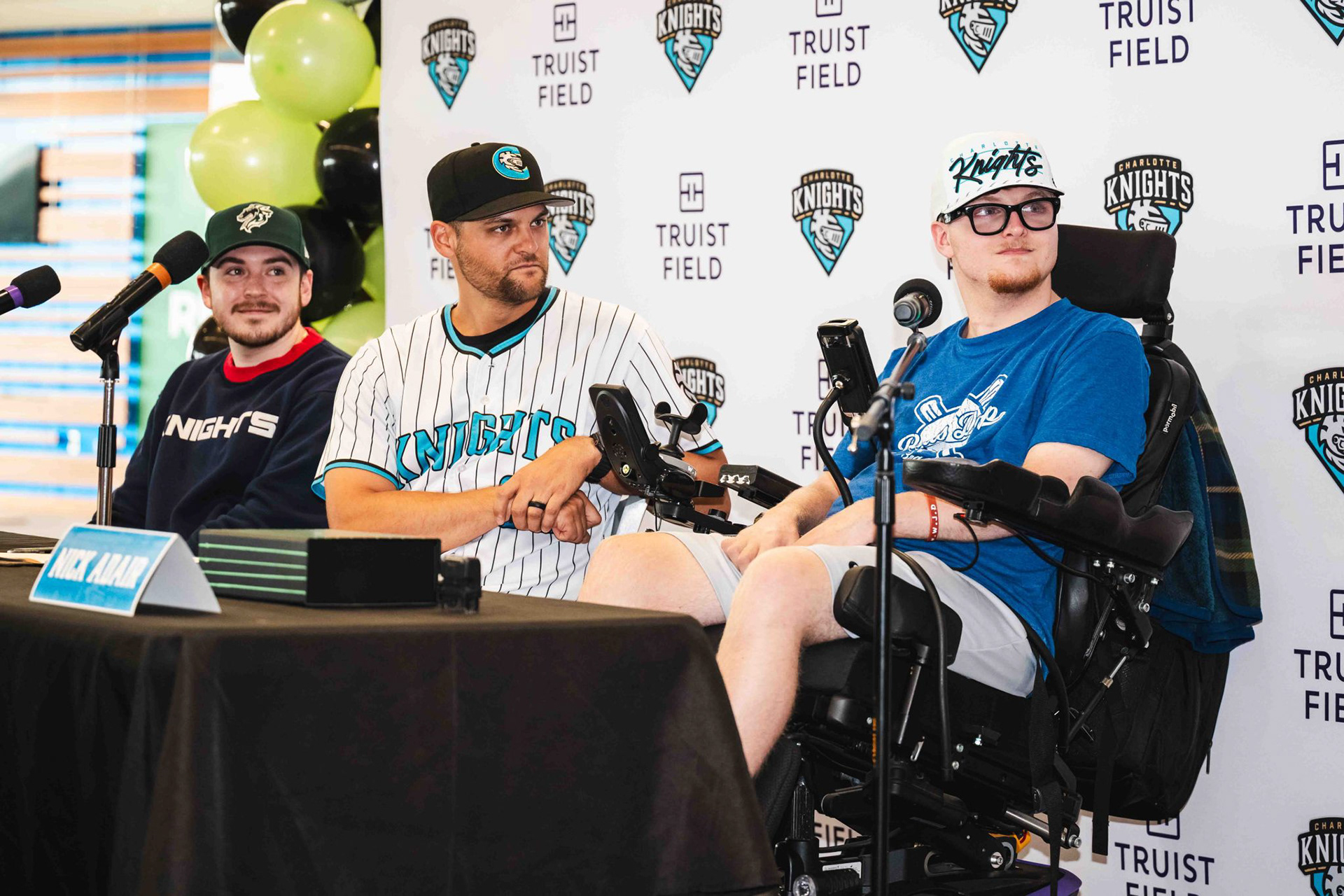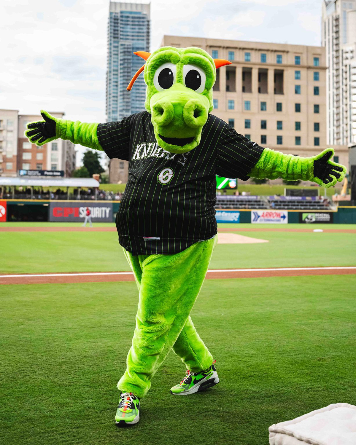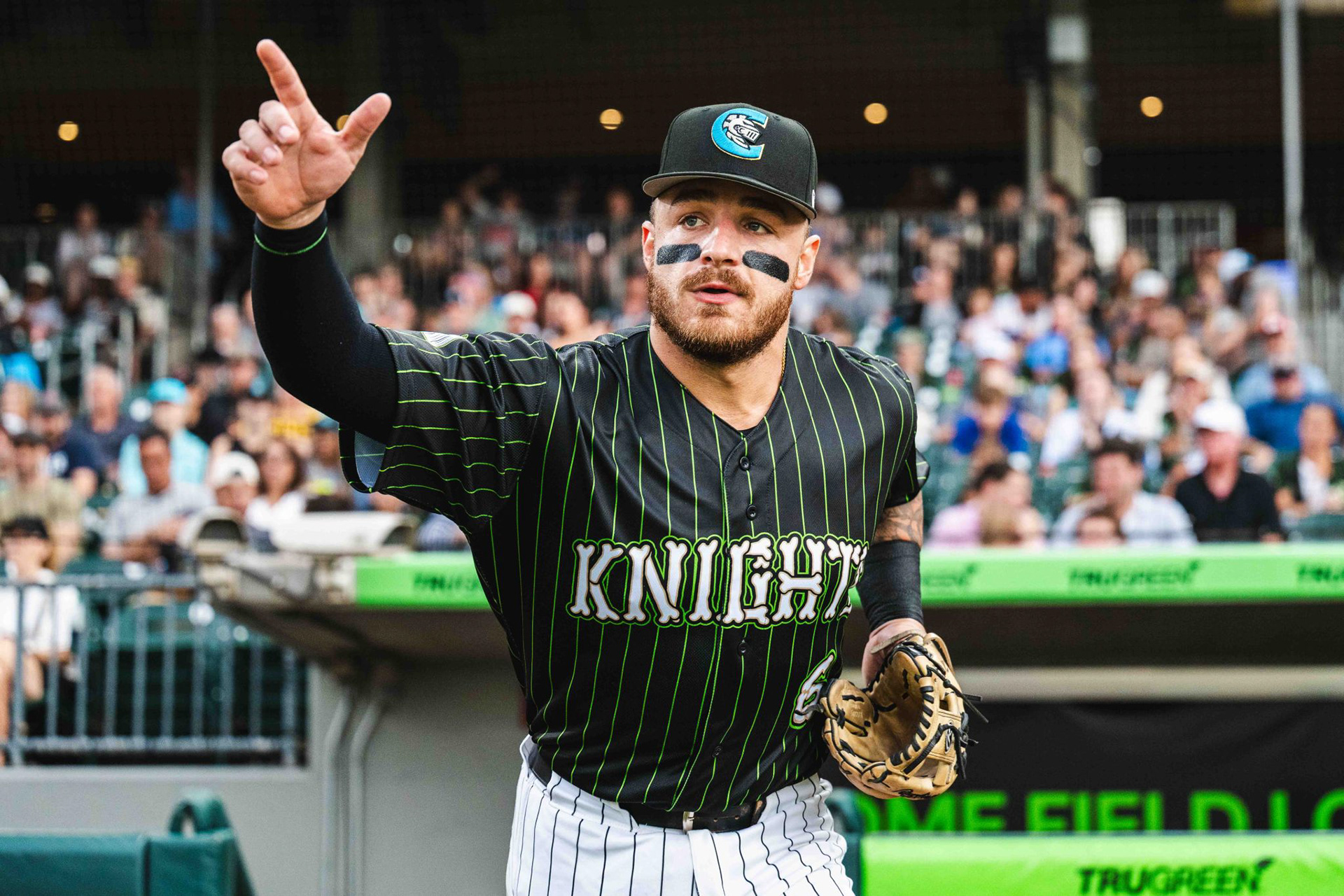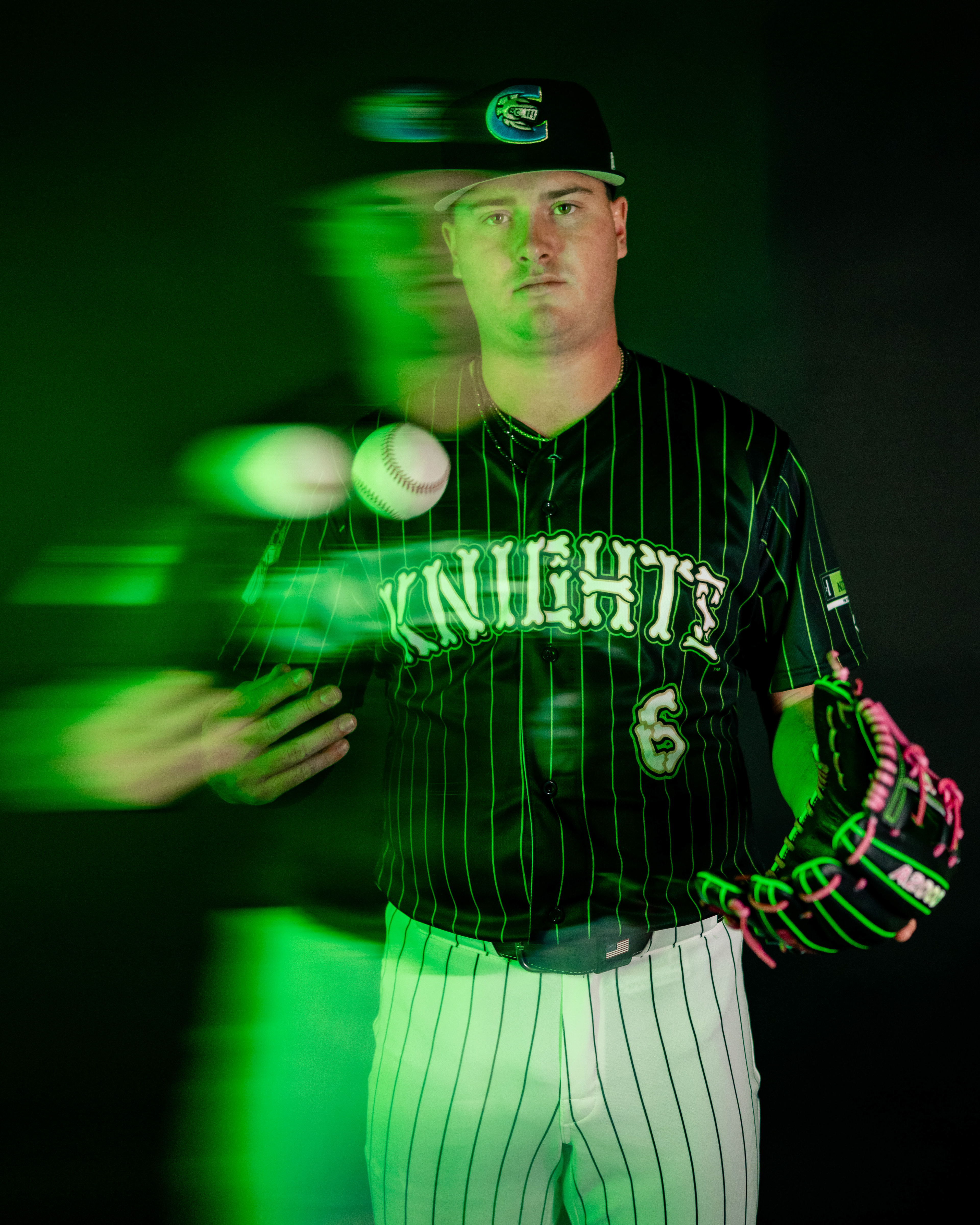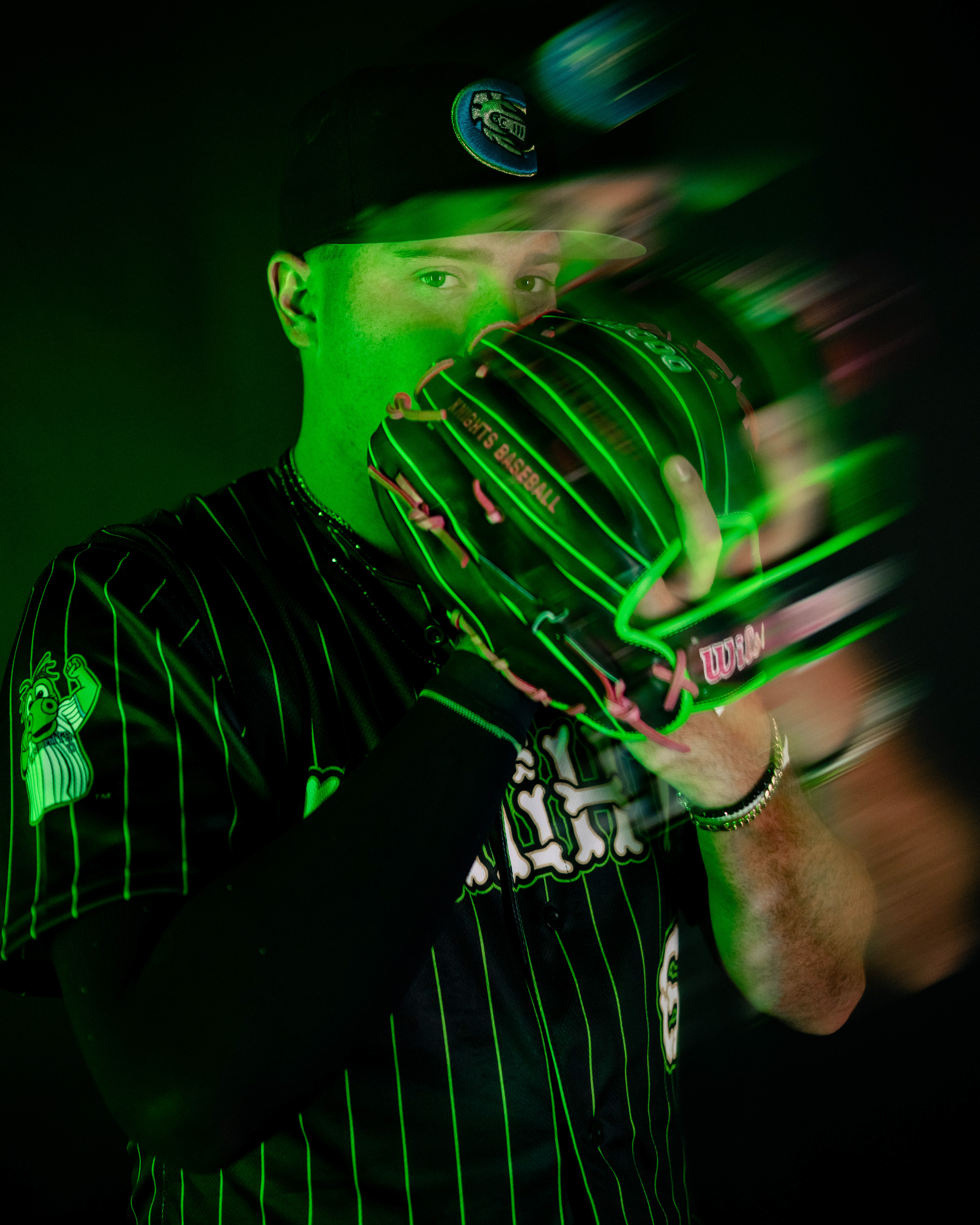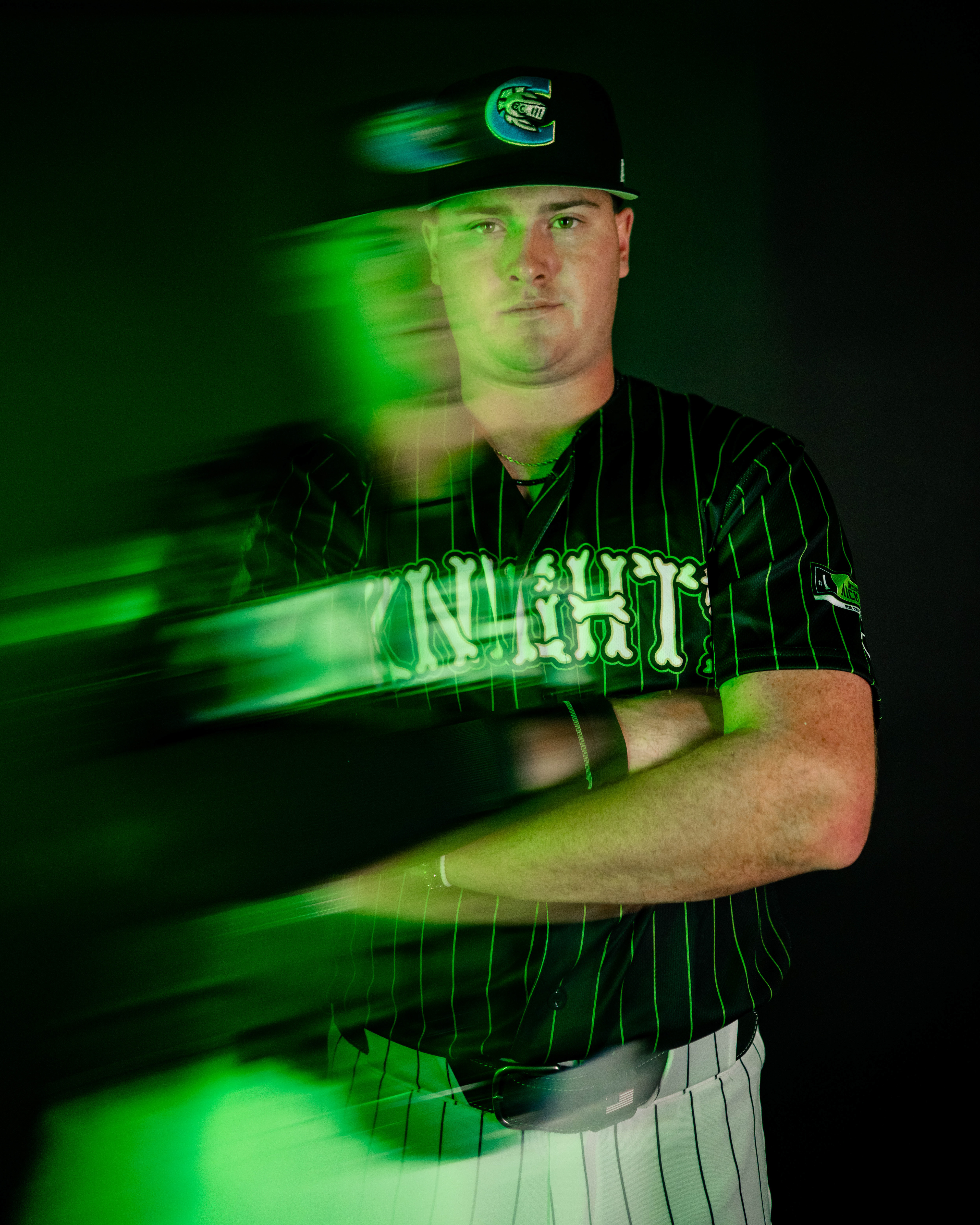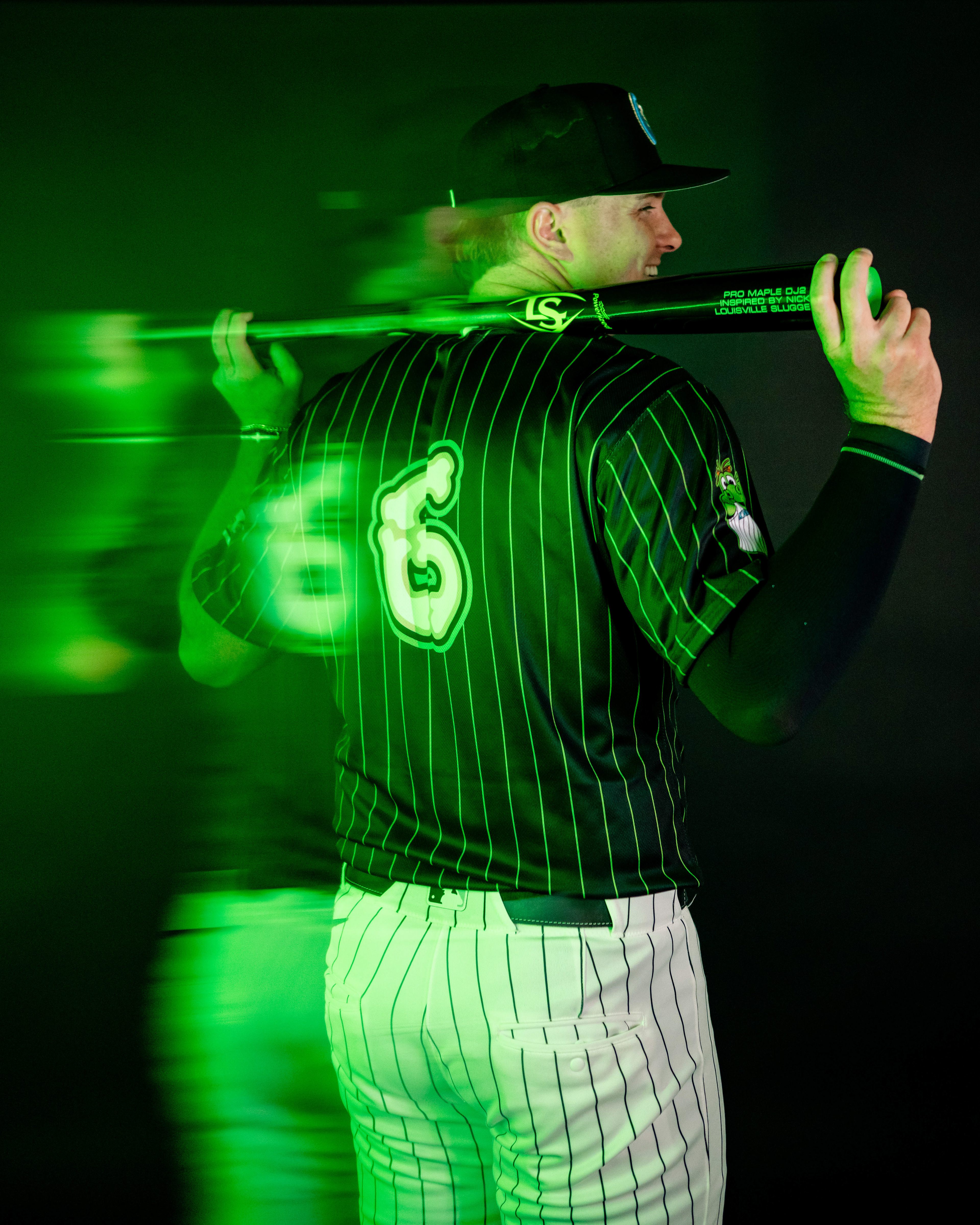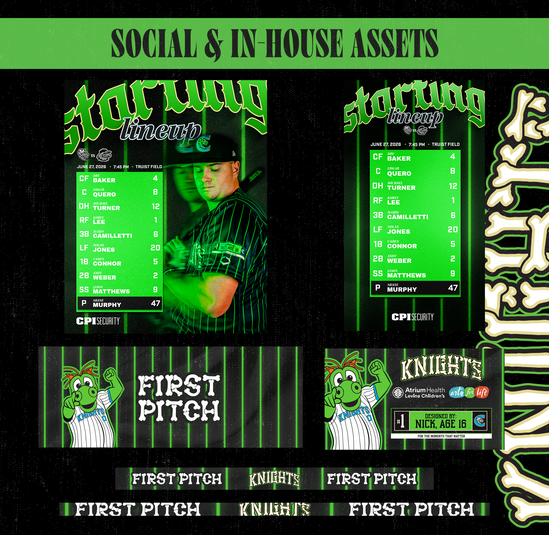
This year, I had the pleasure of bringing Nick's, a patient from Levine Children's Hospital (LCH), vision to life. The Charlotte Knights' LCH Night is a longstanding initiative that serves to bring awareness and fundraising to Levine Children's Hospital. Part of that initiative is selecting one child per year to design a jersey for the team to wear, and this year I was asked if I would be the one to help translate ideas to something field-ready. I can easily say this project is the highlight of my career. Nick and I were able to bring awareness to his spinal column injury and even give a shoutout to Homer the Dragon on the sleeve.
More info here: THE CHARLOTTE OBSERVER ARTICLE | QC LIFE NEWS SEGMENT
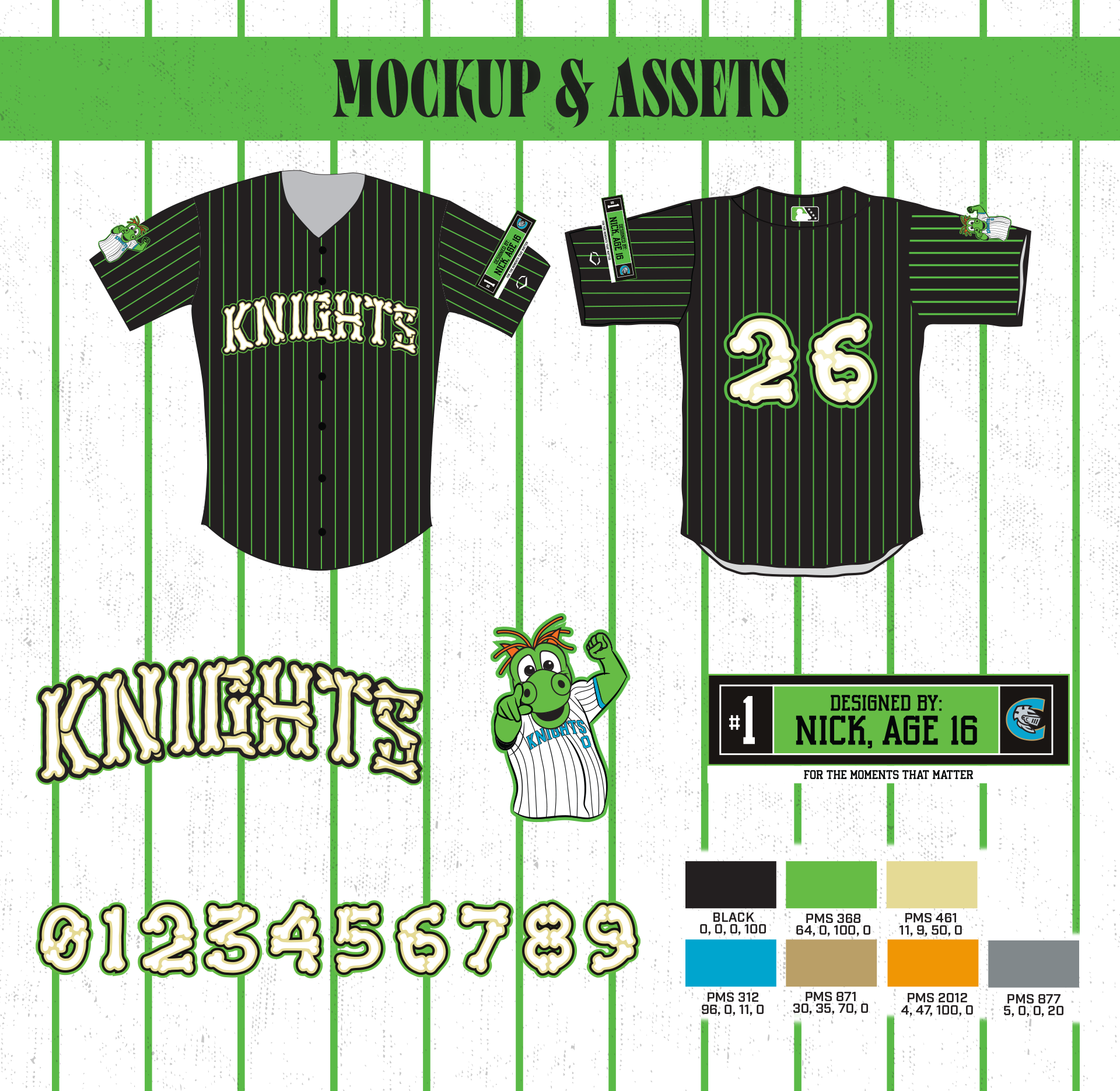
A few aspects of the jersey explained:
GREEN & BLACK COLOR SCHEME: Nick wanted to bring awareness to his spinal column injury, and it just so happens that green and black are the colors for it.
BONE NUMBERS & CHEST LOGO: Around halfway through our design session together, I suggested to Nick the idea of an "x-ray" jersey, alluding to the spinal cord and more awareness. I thought the visual language of an x-ray could translate well, and would be make sense with the things he wanted to promote through his jersey.
GLOW IN THE DARK PINSTRIPES: On the giveaway version of the jersey, the stripes glow in the dark to re-enforce the "x-ray" motif.
LAUNDRY TAG SLEEVE LOGO: In past years, the children's names have been put on the sleeve. I felt that using a laundry tag would allow us to further allude to the fact that this is "Nick's jersey," as if it were game used, or something like that. It also allowed to have cleaner presentation of the Knights / LCH Logos, and let me put Nick's number, #1, on every jersey.
HOMER FLEXING: We went through a few different renditions of a Homer sleeve logo. This is what was decided upon. Nick wanted Homer *on* the jersey someplace, and we decided a sleeve patch would be the best way to have him on there.